Having a property of a high standard in a good location is not always a guarantee of a successful let. In a surplus market it is vital to maximise every marketing opportunity and making the most of your Unipol advert is part of that process. From our experience adverts with quality photos are more appealing to students and tend to lead to more viewings and lettings. Photographs are normally better when taken on a bright day and you should allow plenty of time. Take a few items from your own house and dress the room. It is surprising how a couple of brightly coloured cushions, a blanket, and some flowers can brighten up the place and make it look more desirable. Using good light, space and props can really enhance the look of a room.
Your advert on the Unipol website can display up to 10 photos. Students are mainly interested in interior photos. You should try to take photos of clean and tidy rooms, capturing as much of the room as possible.
General Tips
Digital photography allows you to take lots of photographs and see the results quickly. However before taking the photographs take some test shots and see if you have captured all the areas you wanted to as often unwanted items can creep in to the shot or the lighting is not quite right.
- Take exterior photos on a sunny day (if possible)
- Give your current tenants plenty of warning - they may even want to help!
- Take props to dress the room
- Flowers
- Scatter cushions
- Throws
- Nice duvet cover
- A few books, kitchen utensils, bathroom accessories etc.
- See as an investment
- Although time-consuming offering good quality photographs can help you let quicker
- Good photographs will last a number of years
- What about offering incentives to tenants in residence now to send you photos of their rooms? Some larger agencies are running competitions to encourage students to take part
Room by Room: Before and After
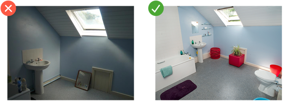
The photo on the right will show how the same room can look dramatically different
Bathrooms
BATHROOMS

BATHROOM TIPS:
- Make Sure its tidy and clean
- The angle should emphasise space and include the sink and shower/bath
- Avoid toilets shots (unless the seat is down and don’t make it the focal point)
- Light is really important
SHOWER ROOM

SHOWER ROOM TIPS (NOTORIOUSLY HARD TO PHOTOGRAPH!):
- Make sure its tidy and clean
- Try and use an angle that includes the sink, the shower and window (if there is one) and draws the eye away from the toilet as the focal point
BEDROOM

BEDROOM TIPS:
- Try and show as much of the room as possible
- If the windows are large include them to give the illusion of space and natural light
LOUNGE

LOUNGE TIPS:
- Tidy, with a ‘homey’ appeal
- Have a focal point for the shot
- Bottles and rubbish are easily removed and look terrible in photos
KITCHEN
KITCHEN TIPS:
- Include as many amenities in the shot as possible
- Try not to include items waiting for the washing up bowl
- A quick tidy can make a huge difference


